We have been given the task of designing and producing a concept for a digital product surrounding a subject of our choosing from the following list:
- Making simple music
- The death of newspapers/books
- Personal security
- The Digital Doctor
- Toy Hack
The beginning of the research for this task and my concept began by looking at the technology available for the first feature of the computer application/program I was designing. I wanted to know the possibilities for technology utilizing something almost all computers and laptops have: the webcam. I looked at some other blog posts I found online including “Measuring distance using a webcam and a laser” and “Face detection using webcams and canvas” to see the type of code and technology that could be available. I, however, know that we simply need the concept for the product but I wanted to see how I would go about doing it realistically.
My initial idea surrounding this was to draw on the ‘Digital Doctor’ subject and use the feature of detecting the user’s distance from screen to help with gaming and for optimum result for the user, health wise, when using it for long periods of time. From this I thought of other features and a target audience to expand my idea.
Focusing on the idea of ‘optimizing productivity’, I looked at the idea of adding in a blocked sites feature which blocks and limits certain sites when studying and/or trying to be productive. I extended this idea to blocking and limiting programs as well as online in order to reduce procrastination and gaming offline. I looked into other applications which are similar such as ‘Let me Study!’, ‘Block Site Plus’ and ‘StayFocusd’ all available from the google chrome app store.
Similarly, I thought to add in a ‘break section’ of the application to add in an ‘away from computer’ form of monitoring as well to promote time away from the computer after hard work to help relieve stress and over working. For this I researched into the ideal times away from the computer, health wise, when working for long period of times. Some general health and safety sites and tips I looked at include ‘nidirect safe computer use’, ‘birkbeck’s Working Safely at your Computer’ and ‘a guardian article’.
The idea and design for the breaks was a small pop up reminder to simply alert people to have a break though in setting this could be changed to be a bigger pop up to encourage the user more depending on the extent to which the user wishes to be engaged by the application. This type of design I would also plan to use for the other segments allowing custom settings to give the user a lot more control.
I decided to design the menu interface rather than the actual application in work as I planned to keep the popups, timers and other features rather simple to be user friendly whereas I hadn’t had a mental vision of the menu therefore I wanted to expand on this.
Design
I started by designing a logo. I wanted to incorporate the idea of studying and the aspect of the computer/screen. I wanted to keep it simple, just black as I hadn’t decided the colour scheme yet.
![]()
The book symbolises the idea of working and productivity and putting it within a rectangle it suggests the screen. Similarly the font I chose looks like a typewriter font (using Special Elite font), again implying this idea of essay writing and work. Study Buddy was chosen due to the rhyming nature and ‘buddy’ having connotations of friendly and informal which hopefully would encourage student and younger users as an assisting application.
Next I started by designing the main page starting with this:
Whilst I had already decided on the colour blue as a soft, calming colour palette, I hadn’t chosen a secondary colour so I used Adobe Kuler to find matching and appropriate colours to go with the particular colour blue I had chosen.
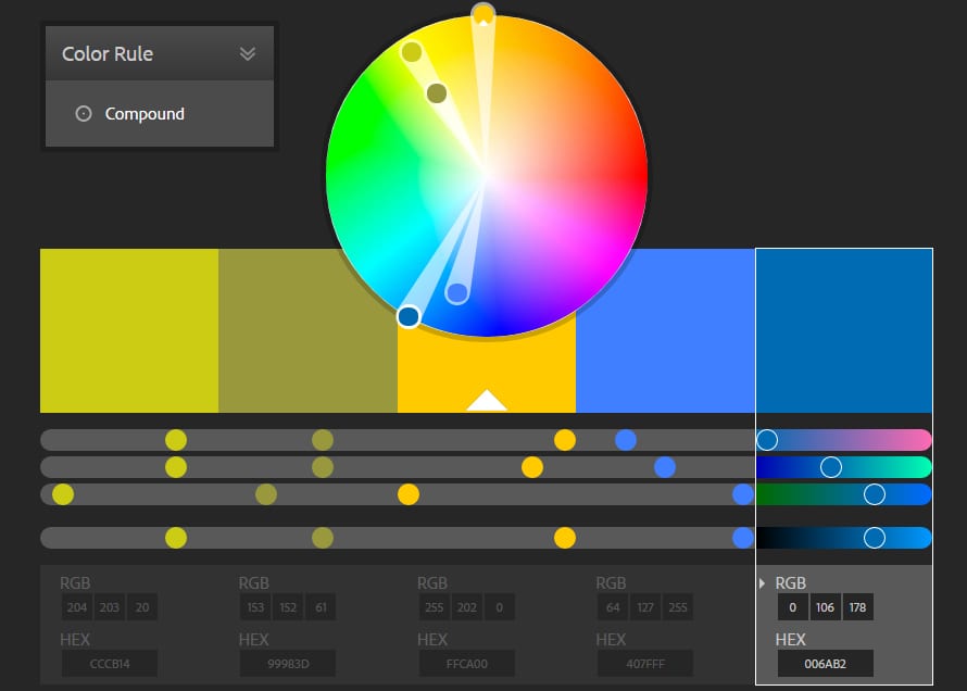
From this I chose the colour yellow to contrast the blue and felt it added an extra dimension and interest to the overall design.
I wanted to keep the style easy to use and simple so I kept the main menu in the form of yellow buttons which you click on to get the particular settings for that feature.
I wanted to keep the logo present for the main menu page to have this product branding and reminder of the product.

I used icons and images from icomoon to make it look more professional and to add this visual element to link to the buttons function. The font I use is Arrière Garde because its adds to the younger audience element due to it being more stylized.
I kept the fonts, colour and style the same throughout the different pages and menus of the application to keep the professional look. In my video demonstrating the look and design of how the pages would be, I showed how each page would fade into each other allowing the app to be user friendly and easy to use. I put in an advanced setting option on each menu and tried to show how the menus would be used and customized by the user. In the next stage of design I would add in extra information about how the user can use each feature, maybe with an information button on the menus. I added in the ‘aims and progress’ button as an extra feature so that the user can see their progress and use it as a schedule for their work. This was simply an extra feature which I have expanded on as I didn’t want to over complicate the idea but I like how it turned out and looked on the menu.