Initially when researching issues in regards to energy consumption and solutions to these problems I looked up applications which help an individual to monitor their energy bills. Smart meters are a reasonable new technology which keeps the home owner and energy companies up to date with their bills and prices. A lot of these smart meters are specific to the energy company and are mostly just an overview of the bill and I wanted to look more specifically on how you could save money and energy after being given this information.
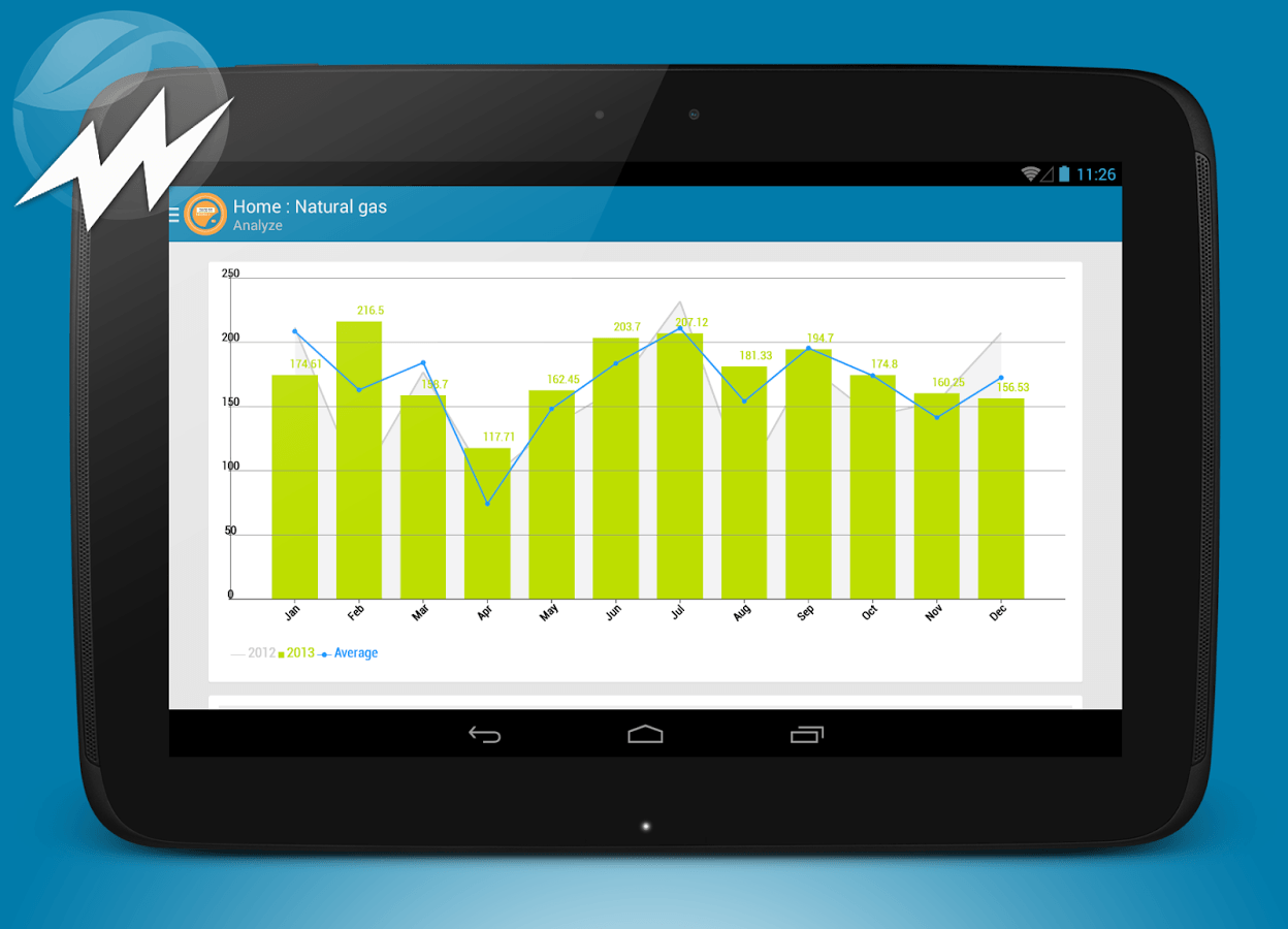
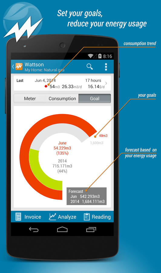
Wattson: Energy Usage Analyzer is an application for sale which analyses your energy bills in a form of pie and bar graphs to help show how much energy you are consuming and compares it to goals you have inputed. Whilst the application is helpful in showing visually the different numbers and calculations of your bills, it can also appear rather complicated, especially if you do not know the context of the energy values. It regards to energy consumption it has some useful extra tools such as the ability to look more in depth into specific days and estimation of your next bill.
One specific problem I want to improve and build on is the idea of pin pointing which appliances and sources in the house are using the most energy and the alternatives to these. For example, how much energy the tumble dryer is taking up and how much money/energy you would save if you dried your washing up outside instead. A way of doing this realistically would to input your day activities and then when seeing the time line of your bill for that specific day, you could put into the application what you were using (i.e. washing machine at 11 am where the peak in the energy consumption is) at a time which makes matching up activity, appliance and energy consumption easier. However because we are just designing the application rather than actually building it, I don’t have to work out the actual mechanics therefore I want to make the application as user friendly as possible to make it clear what is consuming the energy and processes they can do to save money and energy if they want to.
The design of the Wattson app is bright and uses infographics and graphs well to present data which in other ways could appear confusing. In regards to the app I will be creating, bar graphs and pie charts would lend well to the interface but also images symbolising the specific appliance (washing machine, tumble dryer etc) would also work well.